
Network Intros: HGTV
Create two :03 second branded intro indents for new original shows that closely tie in a network brand and the programming they offer.
Project Overview
Research
HGTV (Home & Garden Television) was first conceptually envisioned in 1992. In 1994, HGTV became televised with shows about home building and remodeling, landscaping and gardening, decorating and design, and crafts and hobbies. While the shows have adapted through time, the common theme surrounding the home is still predominant across all of the network’s programming.
Audience
Primarily Millennials and anyone who enjoys shows about home renovation and real estate.
The Design Challenge
The biggest design challenge of branding intros for HGTV was having the intros themselves relate back to the network itself either through the shows it airs or the overall branding look while having both intros look totally different from the other. The second major challenge was trying not to overcomplicate the animation or undermine simplicity. The intros are only :03 seconds long so there isn’t a lot of time to have complex motion. Simplicity was definitely the key to keeping the intros sophisticated and polished while also relating back to HGTV.


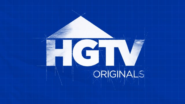
Direction 01: The Blueprint
An original show starts from planning until its conceptualization and realization similarly to how a house is built and renovated. The animation would take viewers through the planning process all the way until the finalized logo appears.
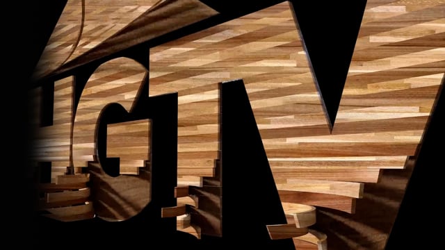
Direction 02: The Materials
You can’t build a home without materials! This direction focuses on the materials used when building or renovating a home. By using a 3D program, there’s a certain space, richness, and quality just like how HGTV creates dimension through space and the quality of the materials they use.


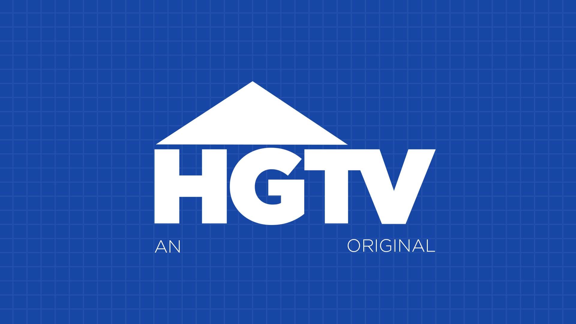
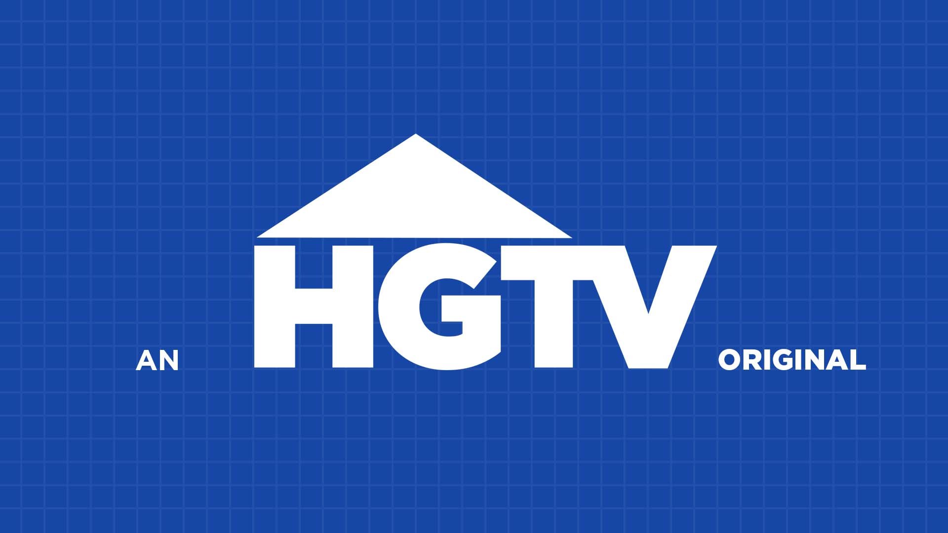
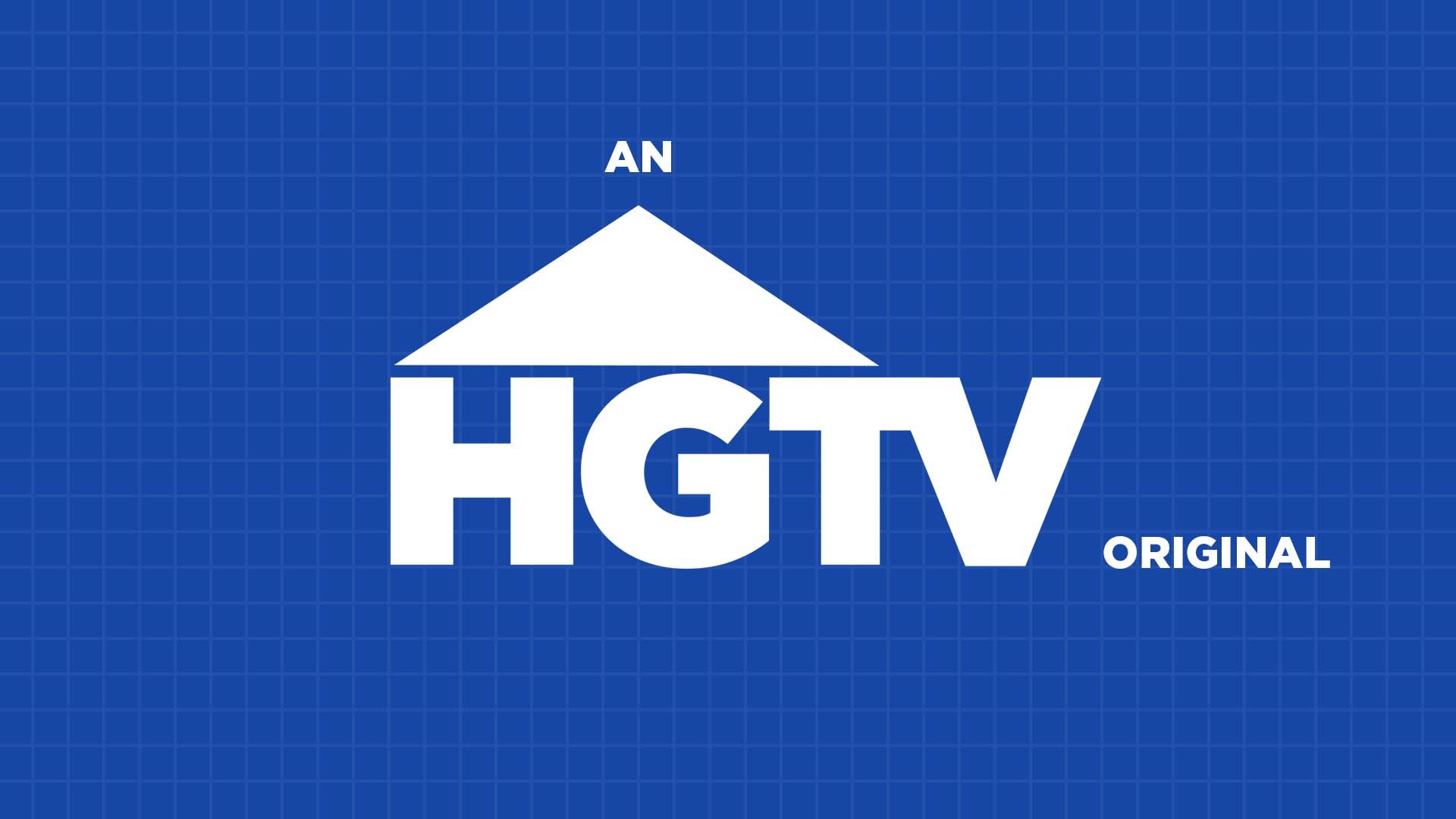
Direction 01: Text Placement Iterations
The proof is in the planning! Iterations are key to any design stage. These iterations explore the placement and weight of the words “an” and “original” while keeping the HGTV logo the main focus of the frame.


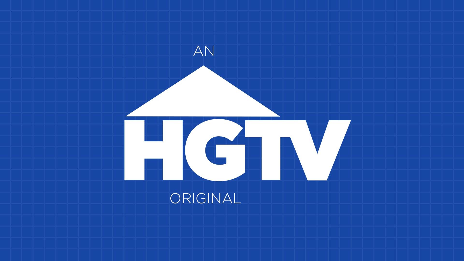
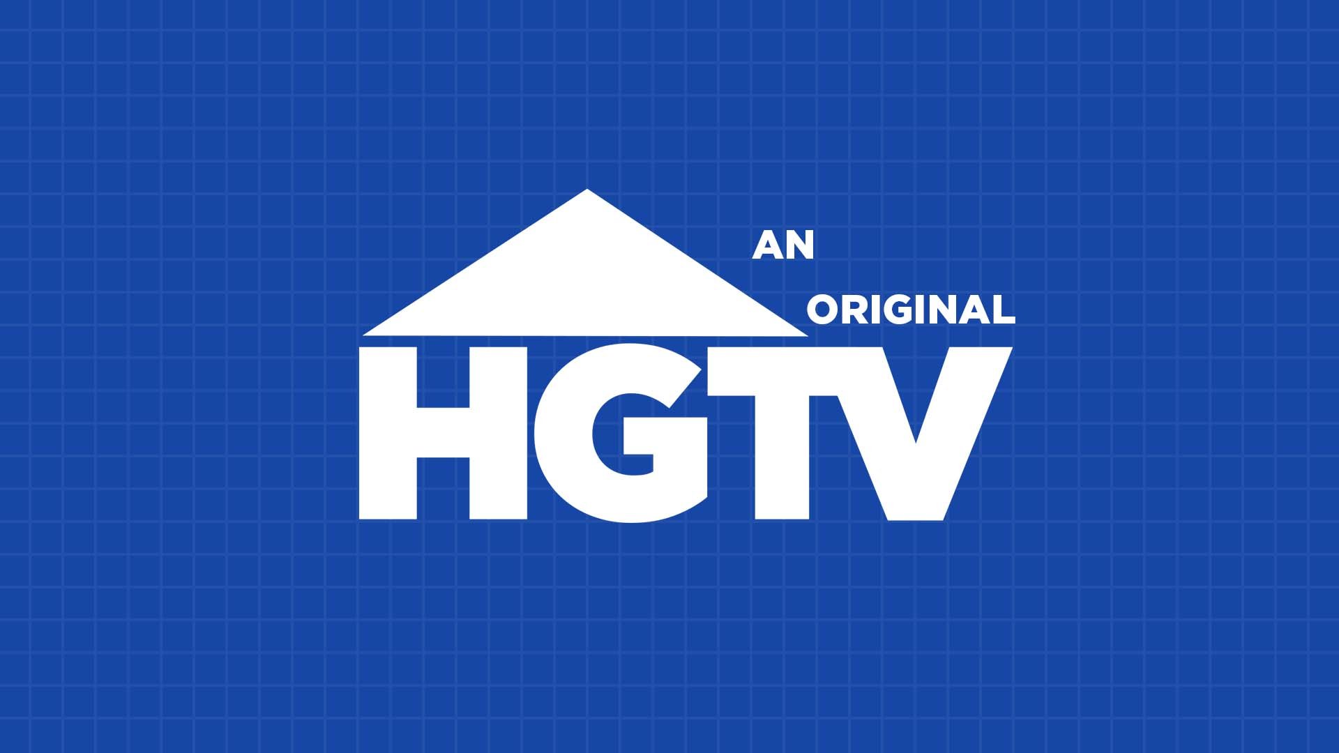


Final Frame
After a long conversation with my art director, we decided that although the phrase “An HGTV Original” is grammatically correct, it made the weight distribution of the frame awkward. By changing the frame to read “HGTV Originals”, it creates simplicity within design as well as a connection to how streaming channels like Hulu and Netflix brand their original series.
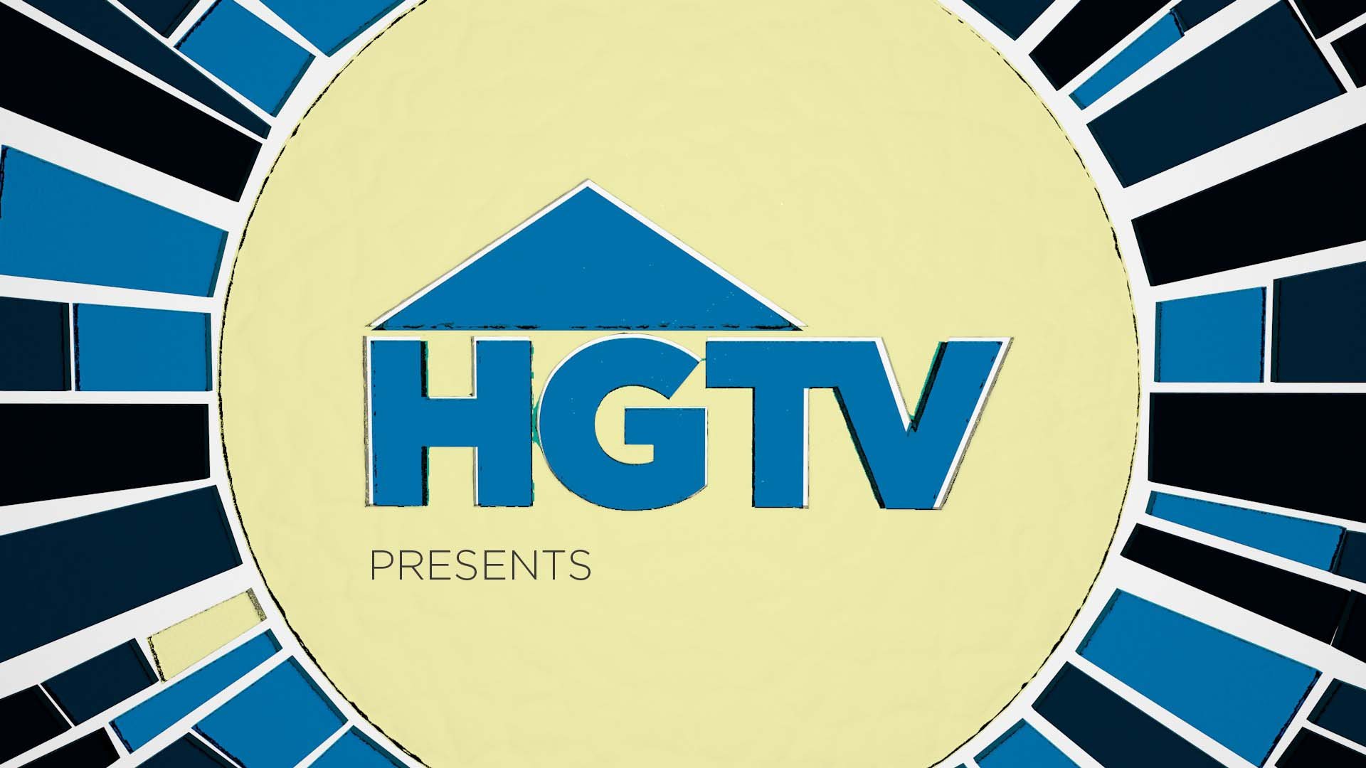
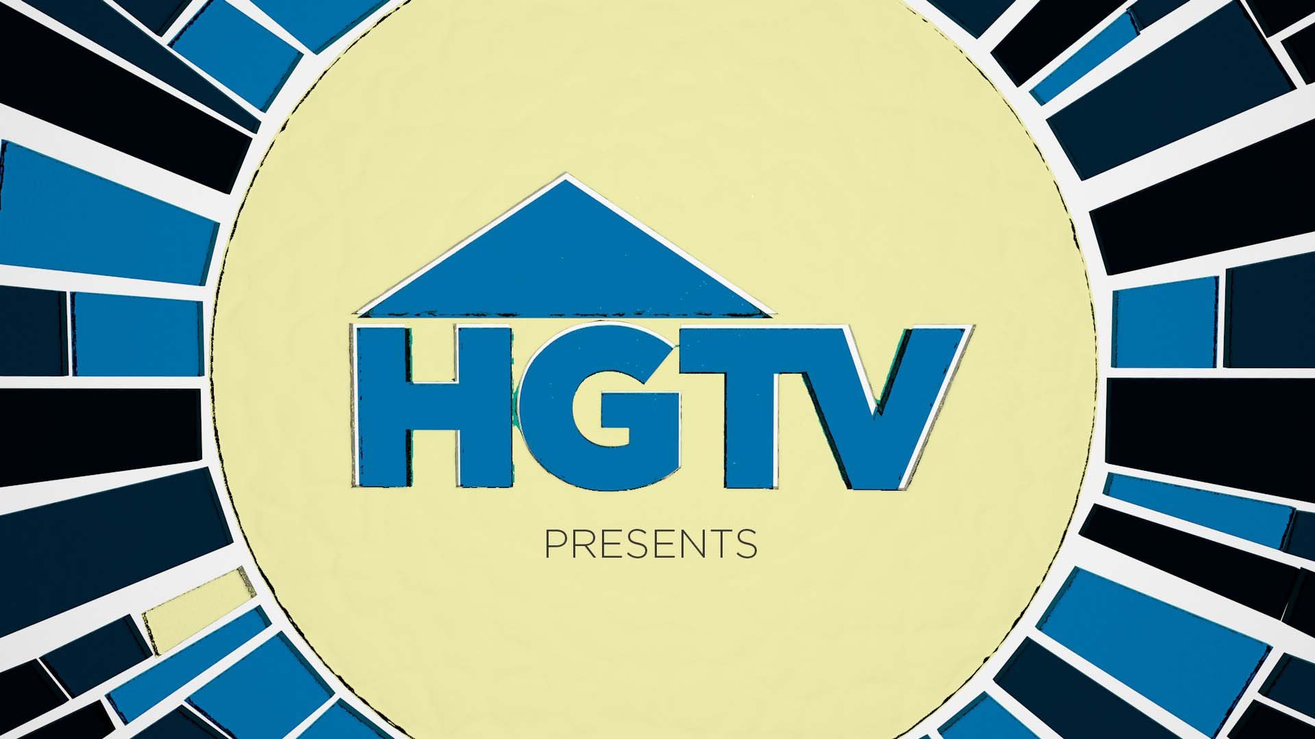
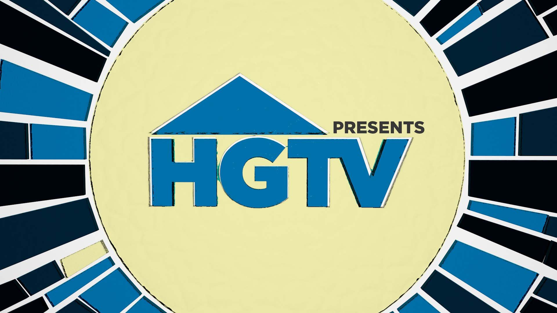
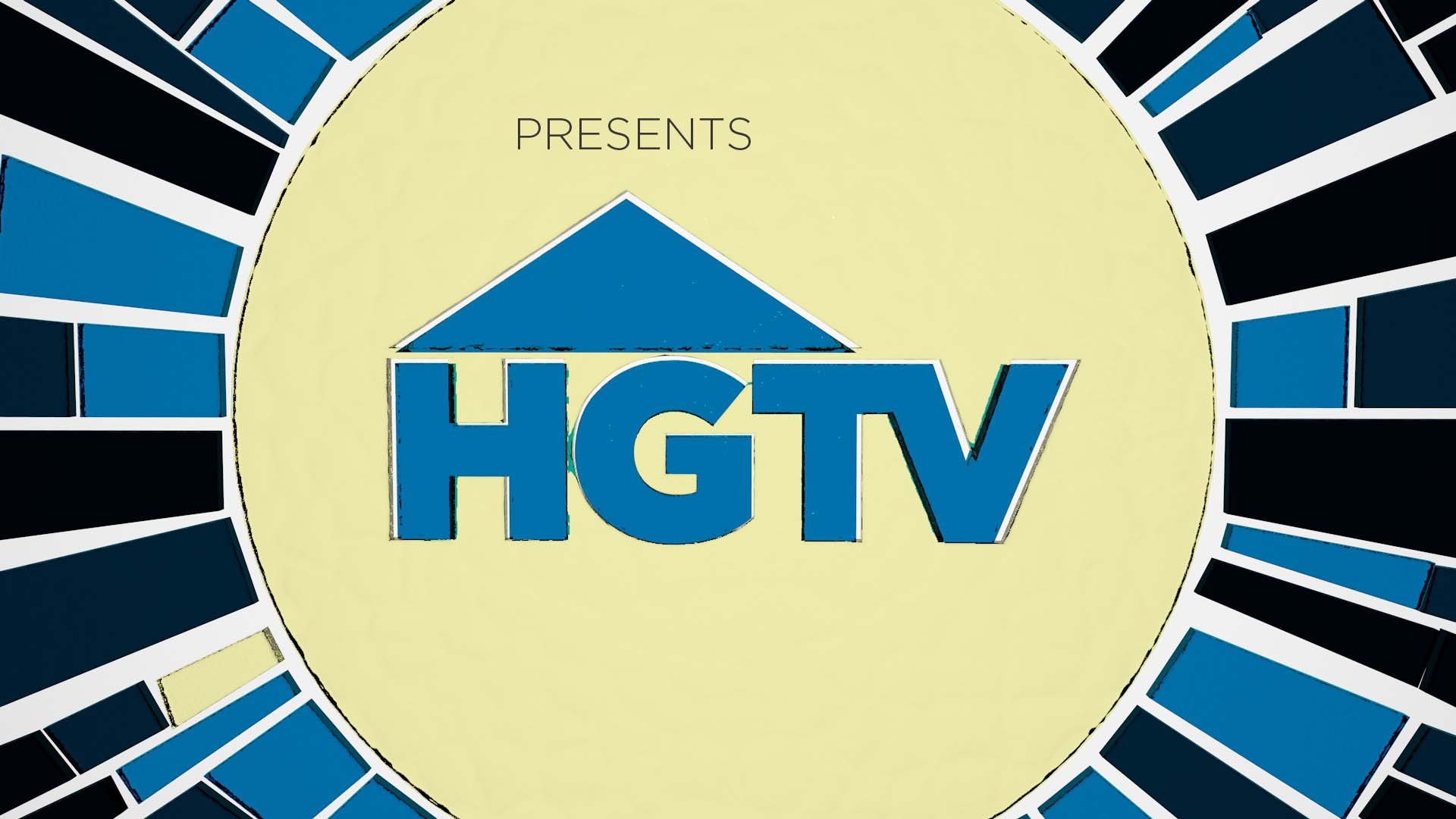
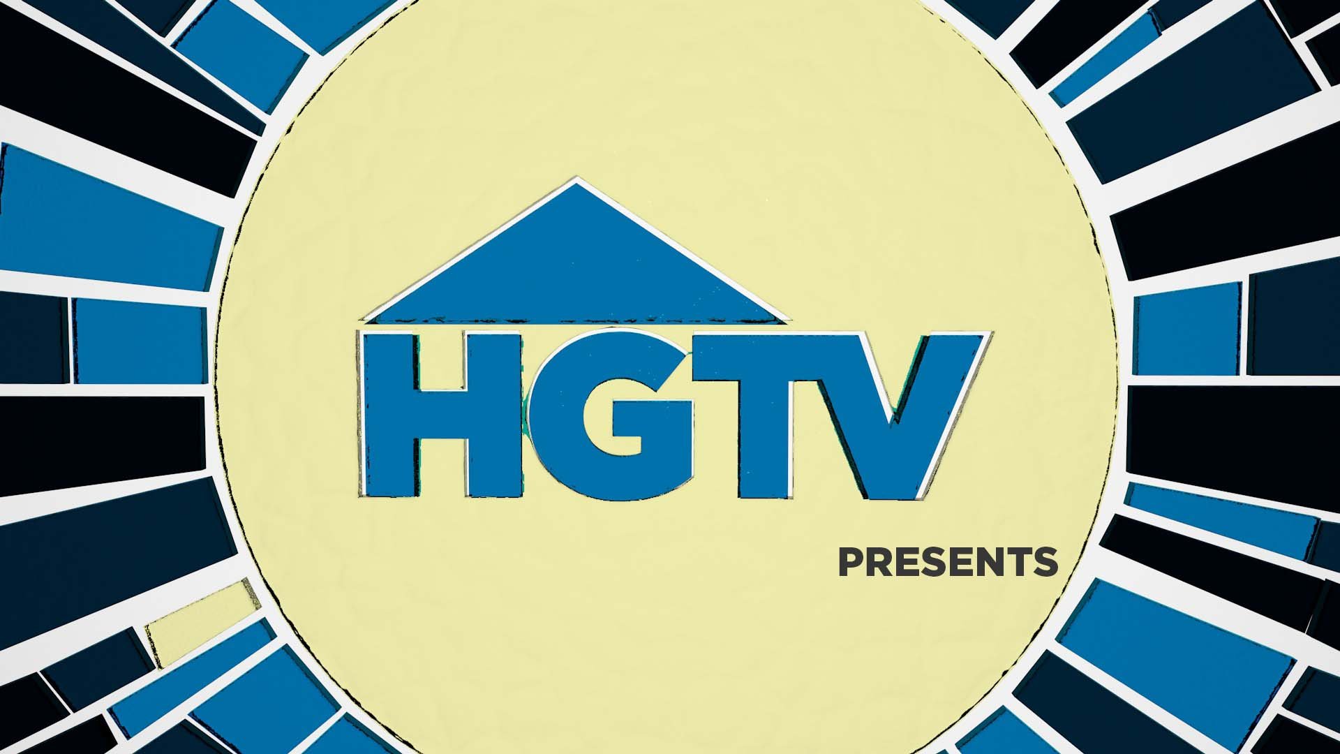
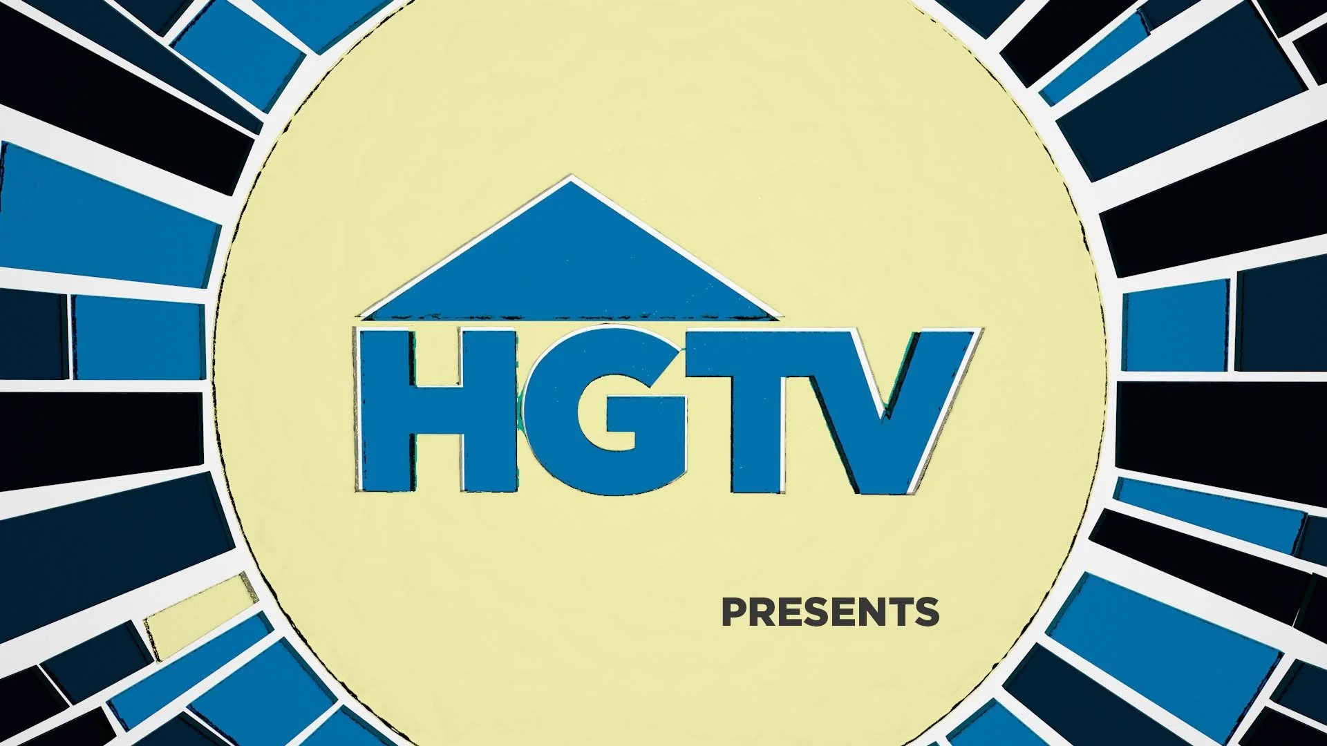
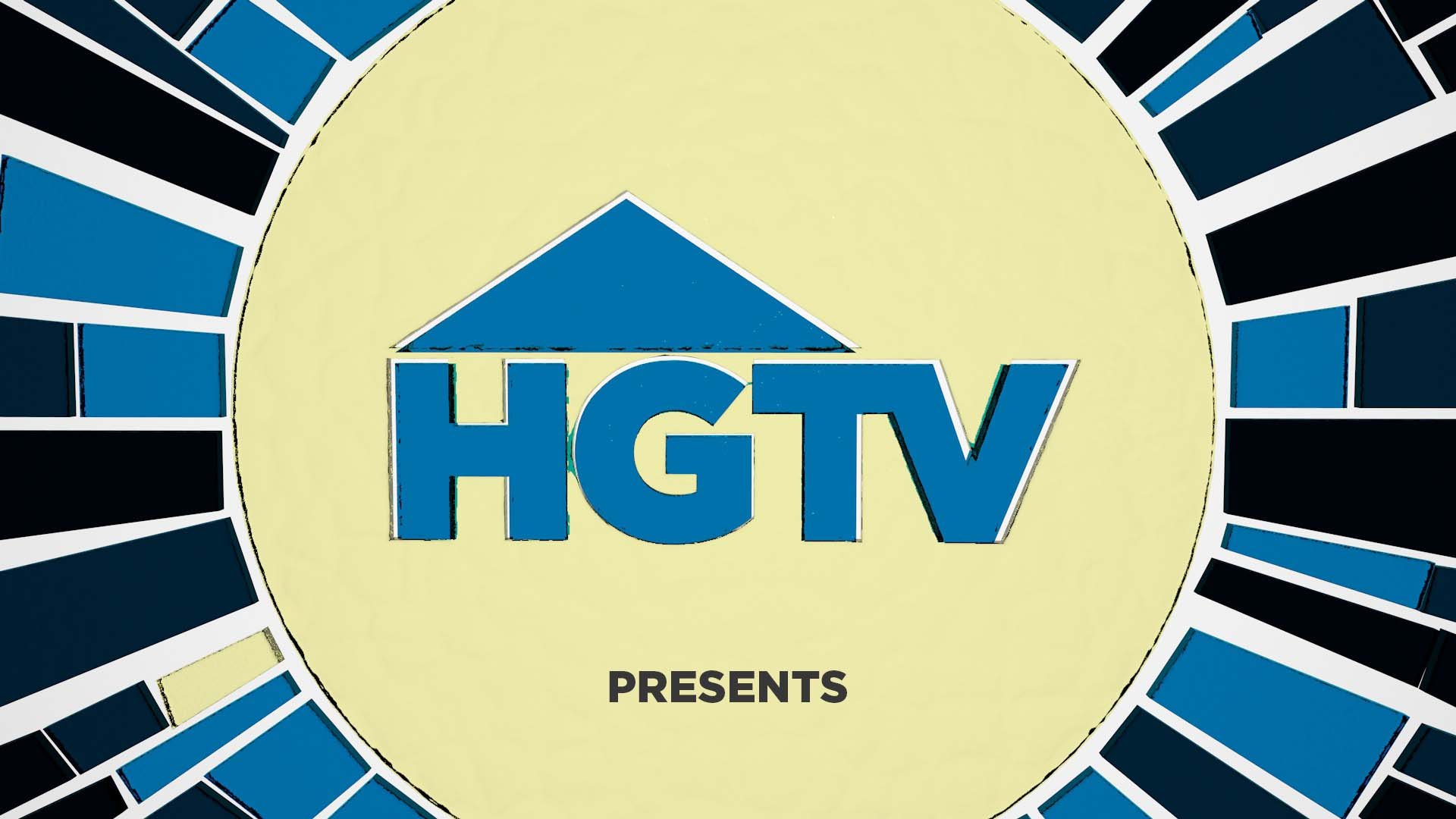
Direction 02: Text Placement Iterations
The second direction took on many looks through its design stage. The initial concept was a stained glass look to compliment the restoration and flipping shows seen throughout HGTV’s network. These frames also explored different placement and weight options for the word “presents”.


Final Frame
This frame went through the most changes as plans often do! After determining that glass was going to take way to much time to render, with approval from my art director I switch to focus on the beauty and simplicity of wood and the unique shapes that bent boards could create. The added metal texture on the word “presents” is a nod to metal appliances, bannisters, and other objects that can be found in a newly renovated home.


First Pass of Animation
This pass was a simple test to see if the concept that lived in my head would be able to become a reality. The main takeaways from this pass was that the word “presents” gets lost in the complexity and intricacy of the moving boards.
Final Intro Animations
Credits
Software:
Cinema 4D, Photoshop, After Effects, Indesign