
Big Surf Sarasota
Create a kickstarter campaign to launch the new fashion brand Big Surf Sarasota.
The Design Challenge
This project is so fun and yet has a different challenge compared to a project solely focused on animation. I think the biggest challenge of Big Surf Sarasota was figuring out what the perfect combinations work best with each other especially when it came to the logo design. I love being able to sit down and create iteration after iteration as well as explore the different design possibilities that a project specific in design has to offer. Design is my happy place so this project was by far has been one of my favorites.

The Logo
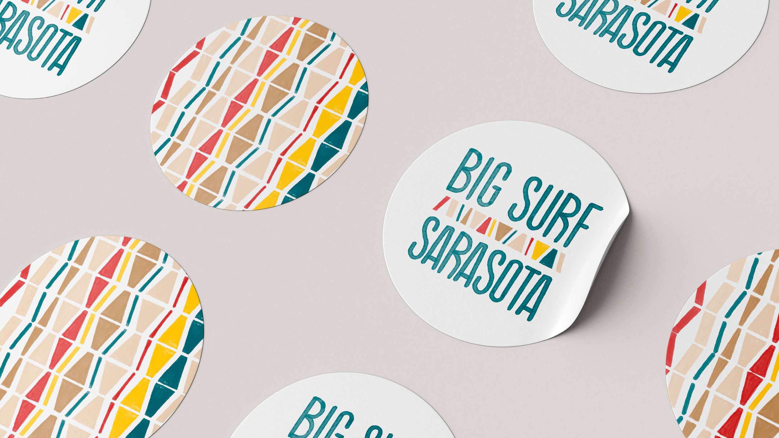
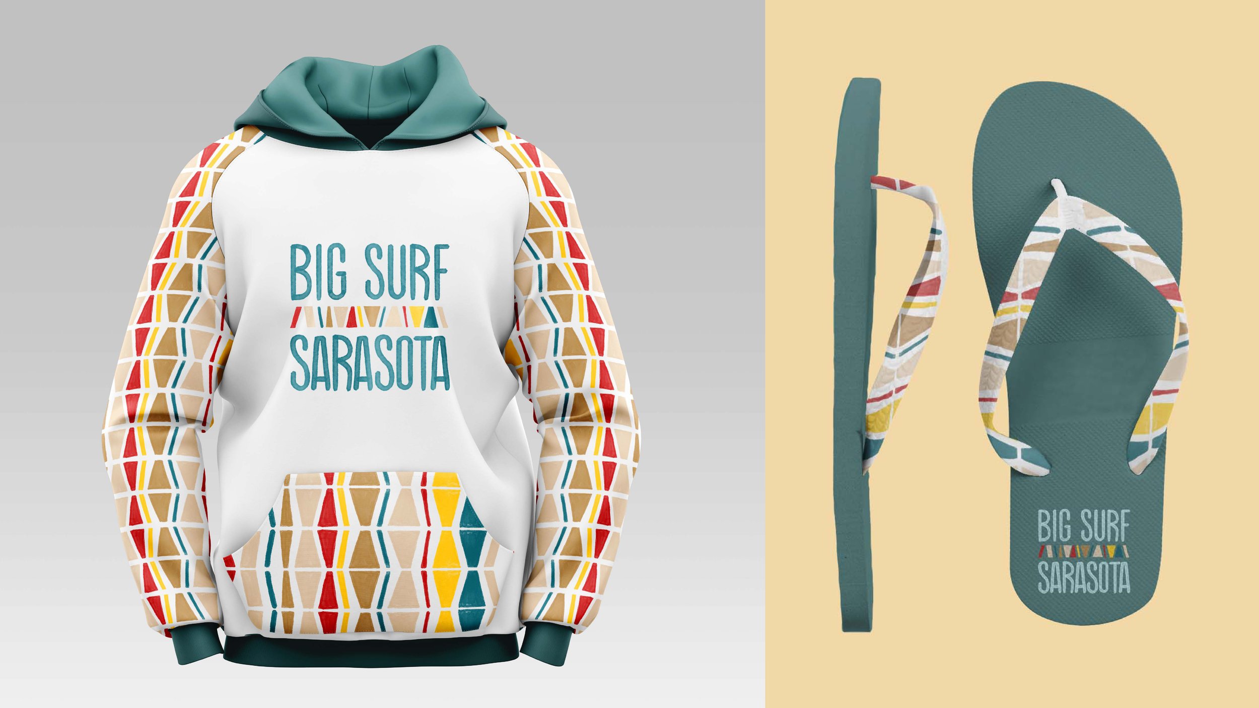
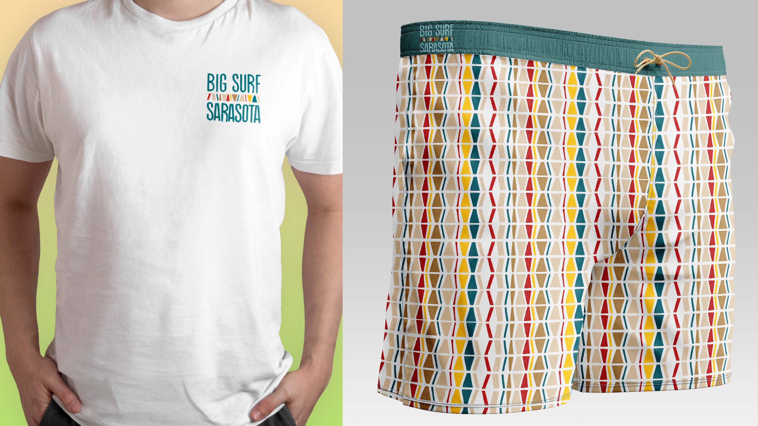
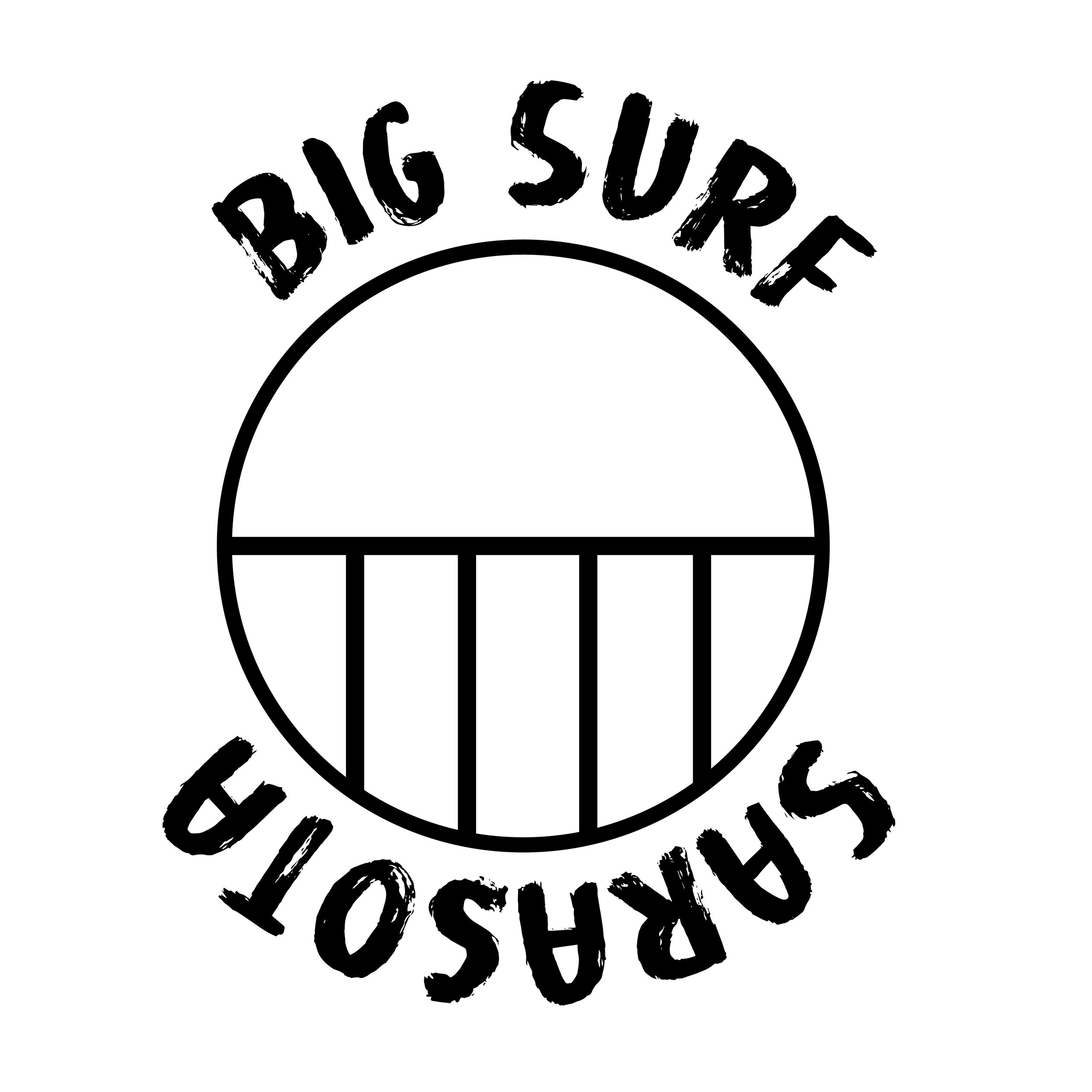
The final logo design was inspired by the ancient Indigenous symbol meaning running water or constant life.
An important aspect of using an ancient Indigenous symbol is respecting the culture without appropriating it. A large portion of the profit made off of merchandise for Big Surf Sarasota will go toward preserving and educating the world about the rich Indigenous history and spirituality behind surfing.
Logo Animation
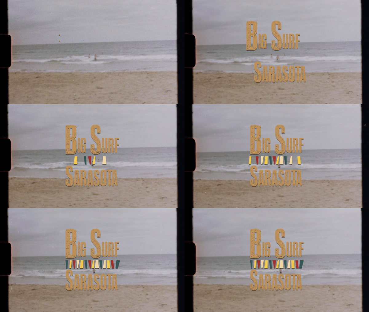
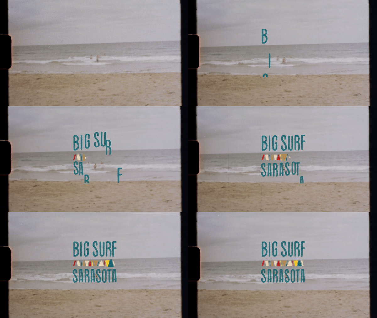
Using the ocean as a form of inspiration, the Big Surf Sarasota logo would move in a freeform manner just like water. By having the animation be loose and fun, it embodies the freeform nature of the hand-drawn letters as well as the surfing culture.
First Logo Iterations
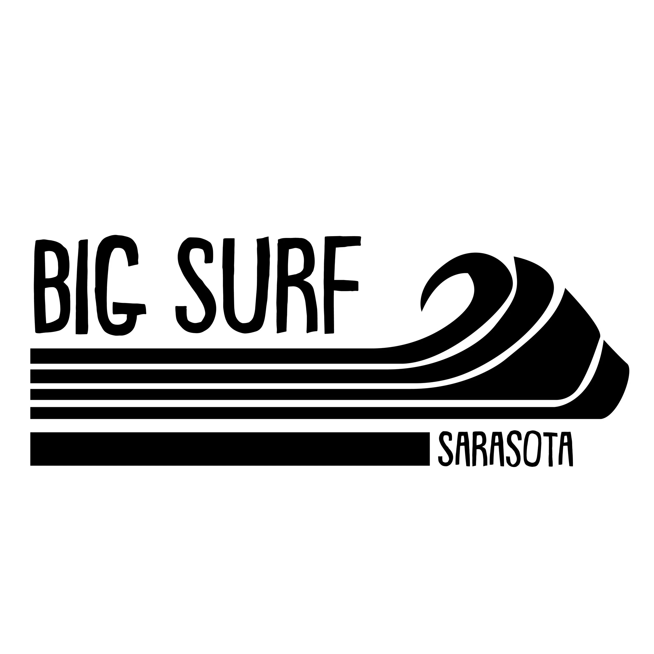
These are the very first logo explorations that were completed for Big Surf Sarasota. The first row is based off of a circle and the many ways that the circle motive can be used to represent waves, the sun, or the horizon. The second row focused more on the shape language of the surfboard. The final row is based off of ancient indigenous symbols for water or the sun.






The Final Four Iterations
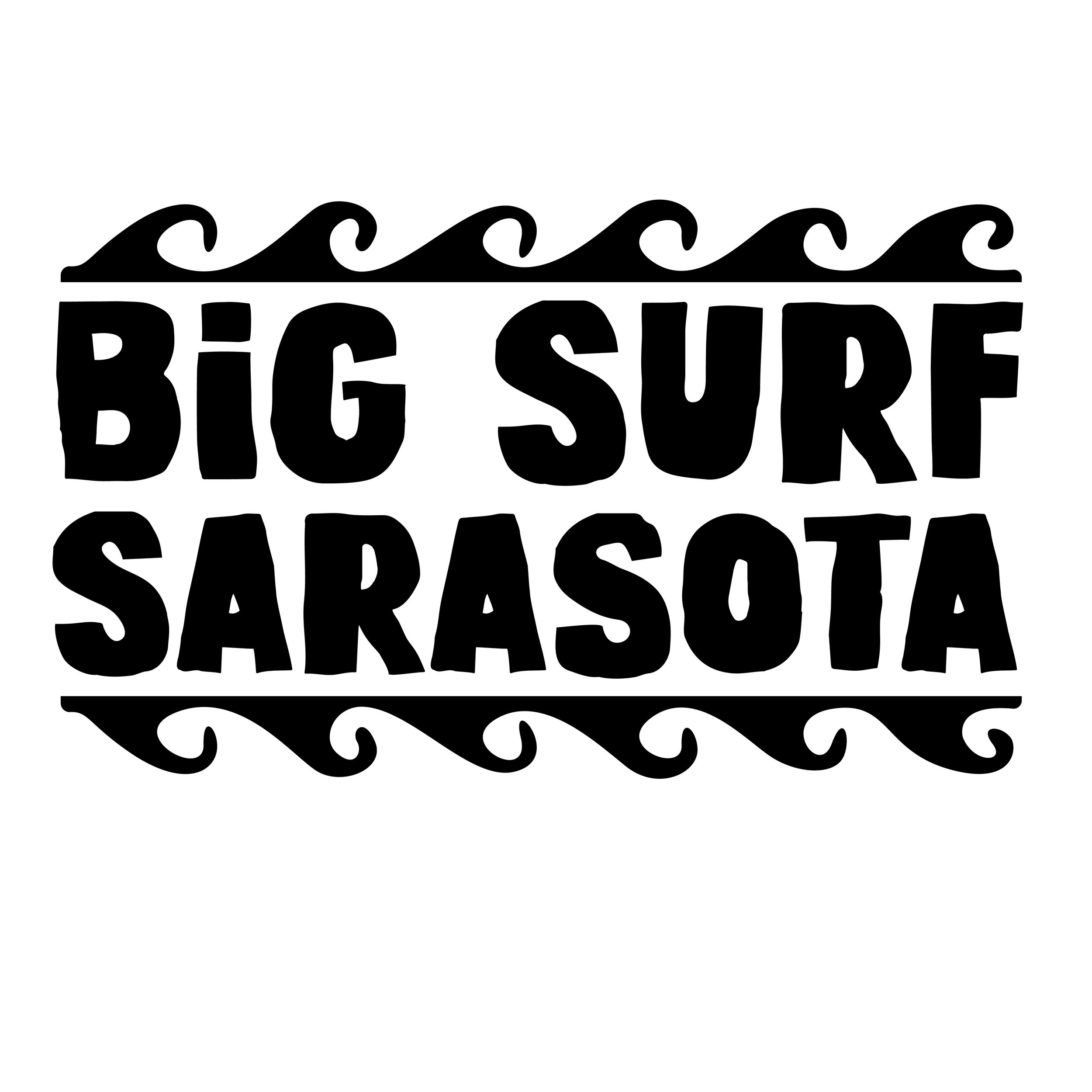
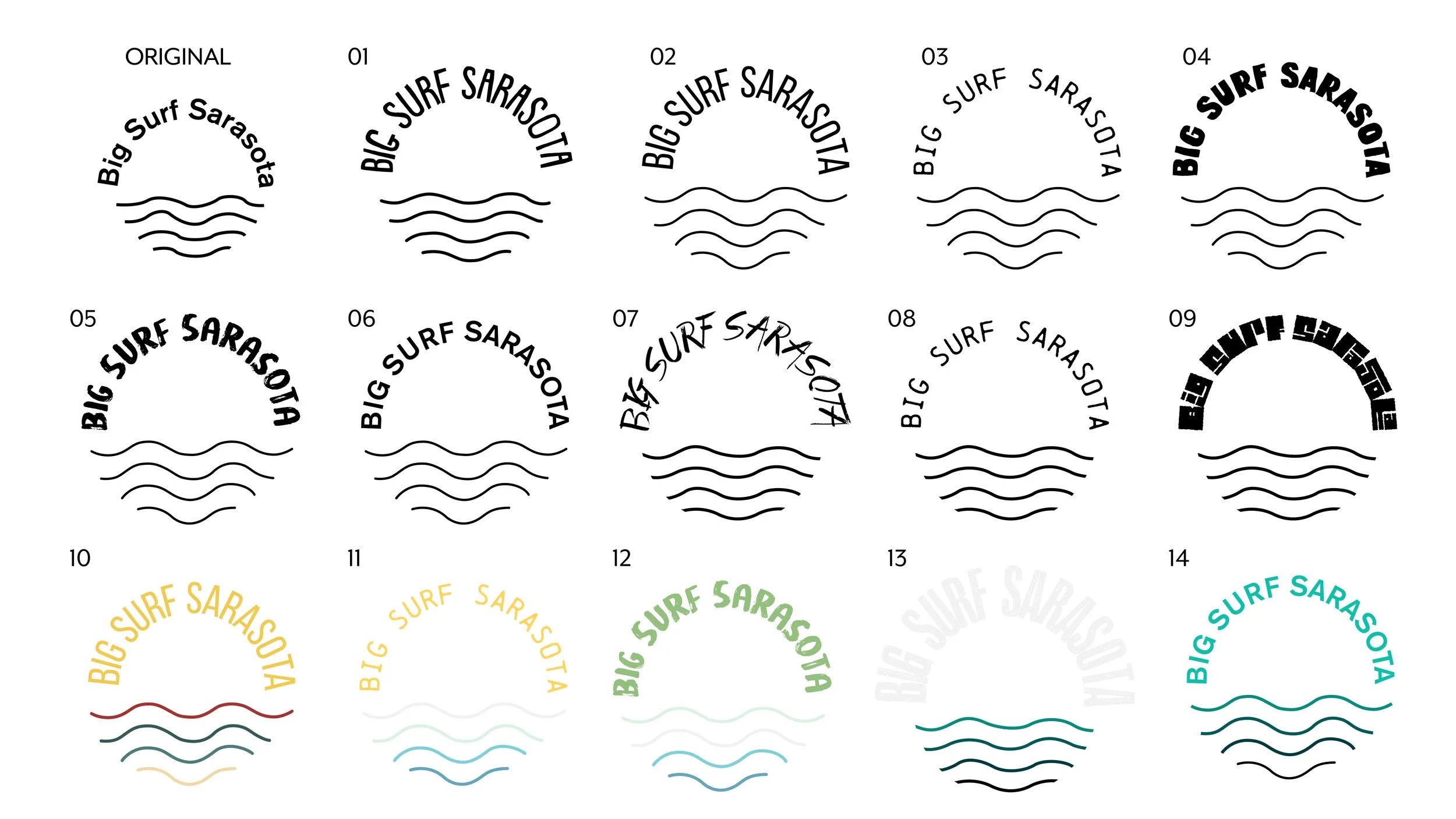
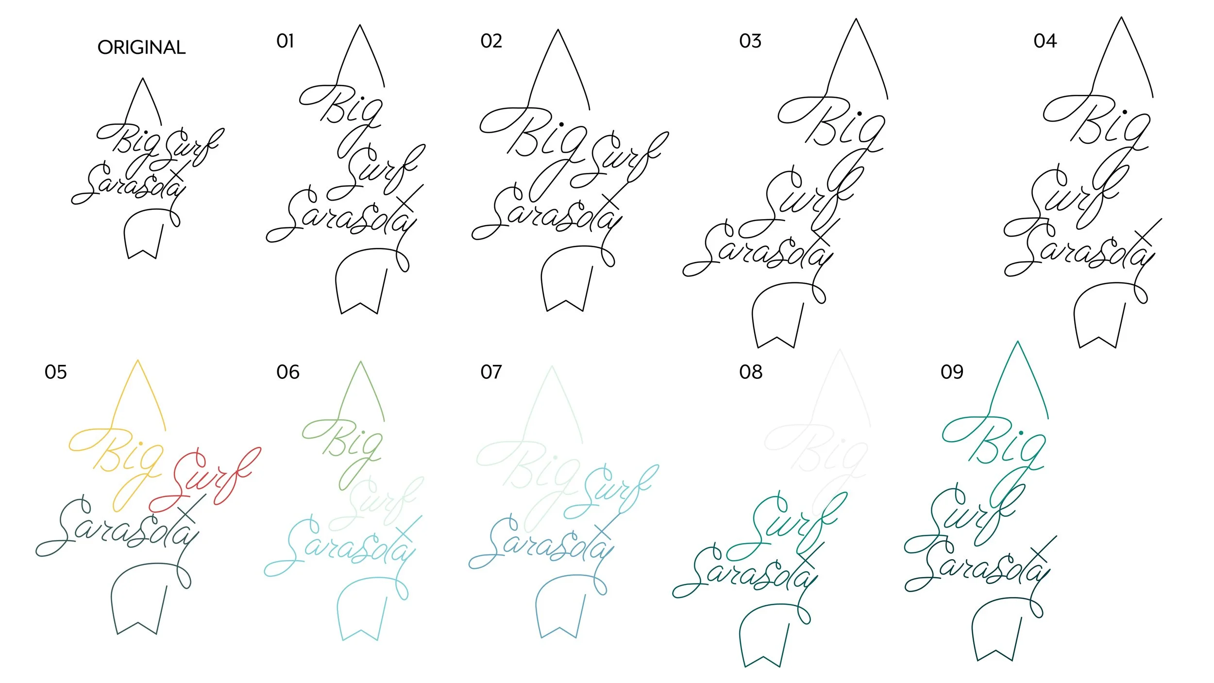
It wouldn’t be a design project without more iterations! The explorations below were the logos that were favorited by the client after the initial pitch. I really wanted to focus on the way that different typefaces looked with each logo as well as the clean-up of the linework.


Dive Into More Iterations
The more iterations of a logo you do the better your results will be. We decided that it would be best to go with my own handwritten font using a stencil of one of the more structured fonts I had explored before. The handwritten aspect would give the brand certain casualty that you would associate with surfing brands.


It Starts With A Style
Featured below are three potential styles in which the brand could embody.
The first one was inspired by a minimalistic hand-drawn style that embodies the peaceful and more spiritual vibes that a surfer may experience with a lighthearted, cooler pastel palette. The second direction encompassed a more monochromatic color palette taken directly from the ocean as well as traditional typography with photographic elements combined, a more modern approach. The final direction which was ultimately chosen was inspired by the height of surf culture from the 1950s and 1960s with its primary color palette and vintage film grain.


Animation Explorations
Below are the first and second passes of the animated logo that would be used in a pitch video for the brand Kickstarter.
Credits
Software:
Illustrator, Photoshop, After Effects, Indesign
